[PT-BR]
Merita
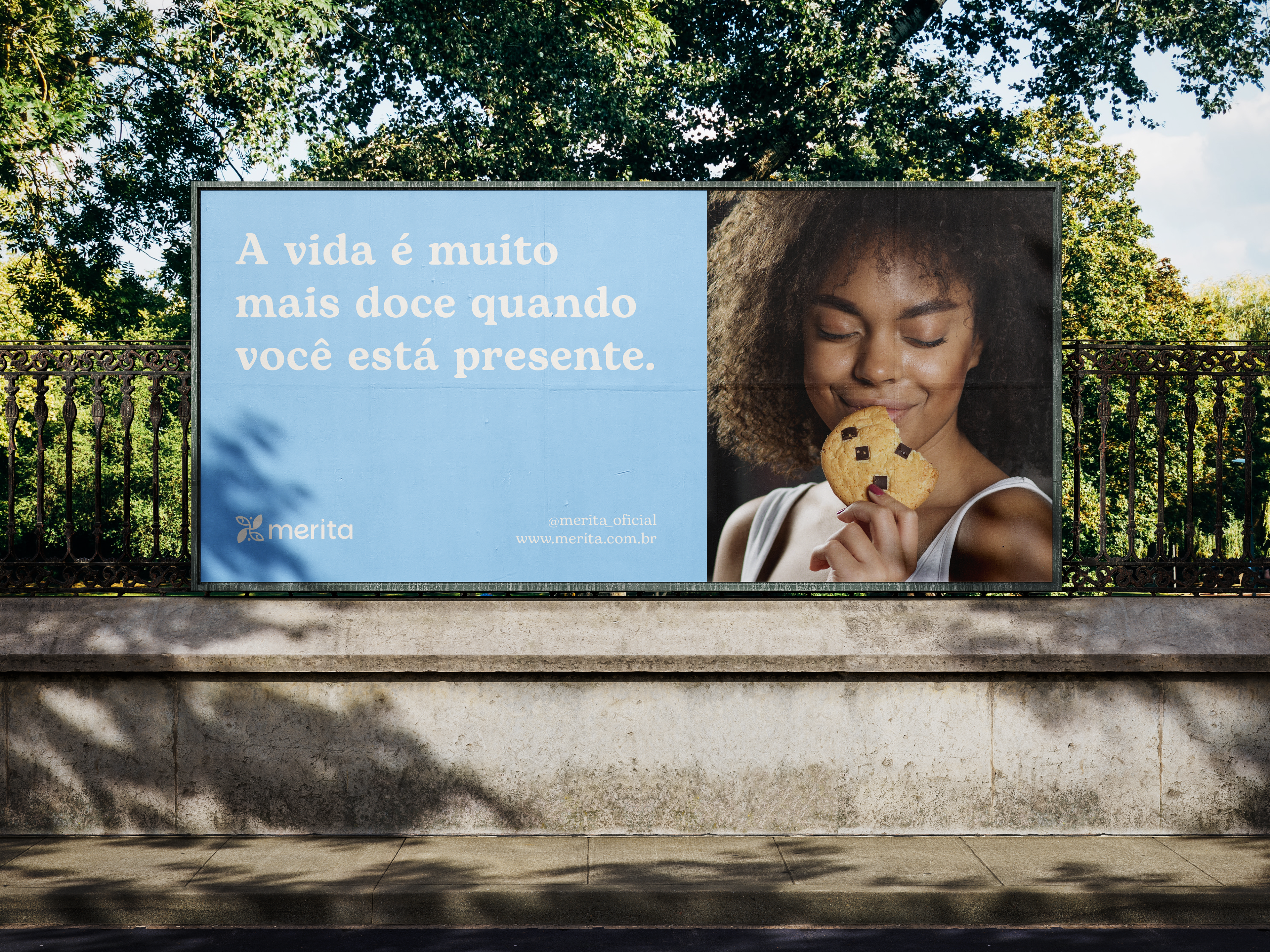
→ A Merita nasceu do desejo de tornar o cotidiano mais leve — e de mostrar que uma pausa doce não precisa ser um peso,
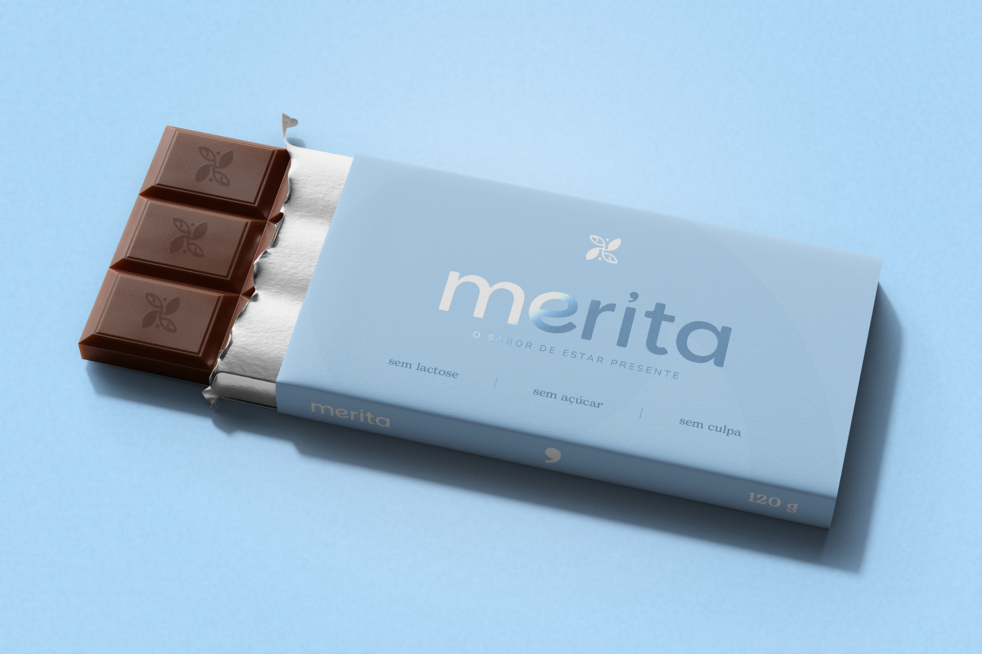
mas um cuidado. Aqui, o sabor não vem apesar das restrições. Ele existe justamente por elas: para quem vive com escolhas conscientes, mas não abre mão de sentir prazer. Sem lactose. Sem açúcar. Sem culpa. Com intenção.
É um convite: parar um instante, respirar, escolher o que faz bem. Criar um ritual no meio da rotina. Um gole de café. Um doce funcional. Um lembrete silencioso de que o corpo importa, e a mente também. A proposta é simples, mas profunda: unir doçura e funcionalidade para quem acredita que autocuidado é mérito, não prêmio. É direito, não exceção.
[EN]
→ Merita was born from the desire to make everyday life feel lighter — and to show that a sweet pause doesn’t have to be a burden, but an act of care. Here, flavor doesn’t exist in spite of restrictions. It exists because of them: for those who live with conscious choices yet refuse to give up on pleasure. Dairy-free. Sugar-free. Guilt-free. With intention.
It’s an invitation: to stop for a moment, breathe, and choose what feels right. To create a small ritual in the middle of the
routine. A sip of coffee. A functional treat. A quiet reminder that the body matters — and the mind does too. The idea is
simple, yet profound: to unite sweetness and functionality for those who believe that self-care is a merit, not a reward.
A right, not an exception.
[PT-BR]
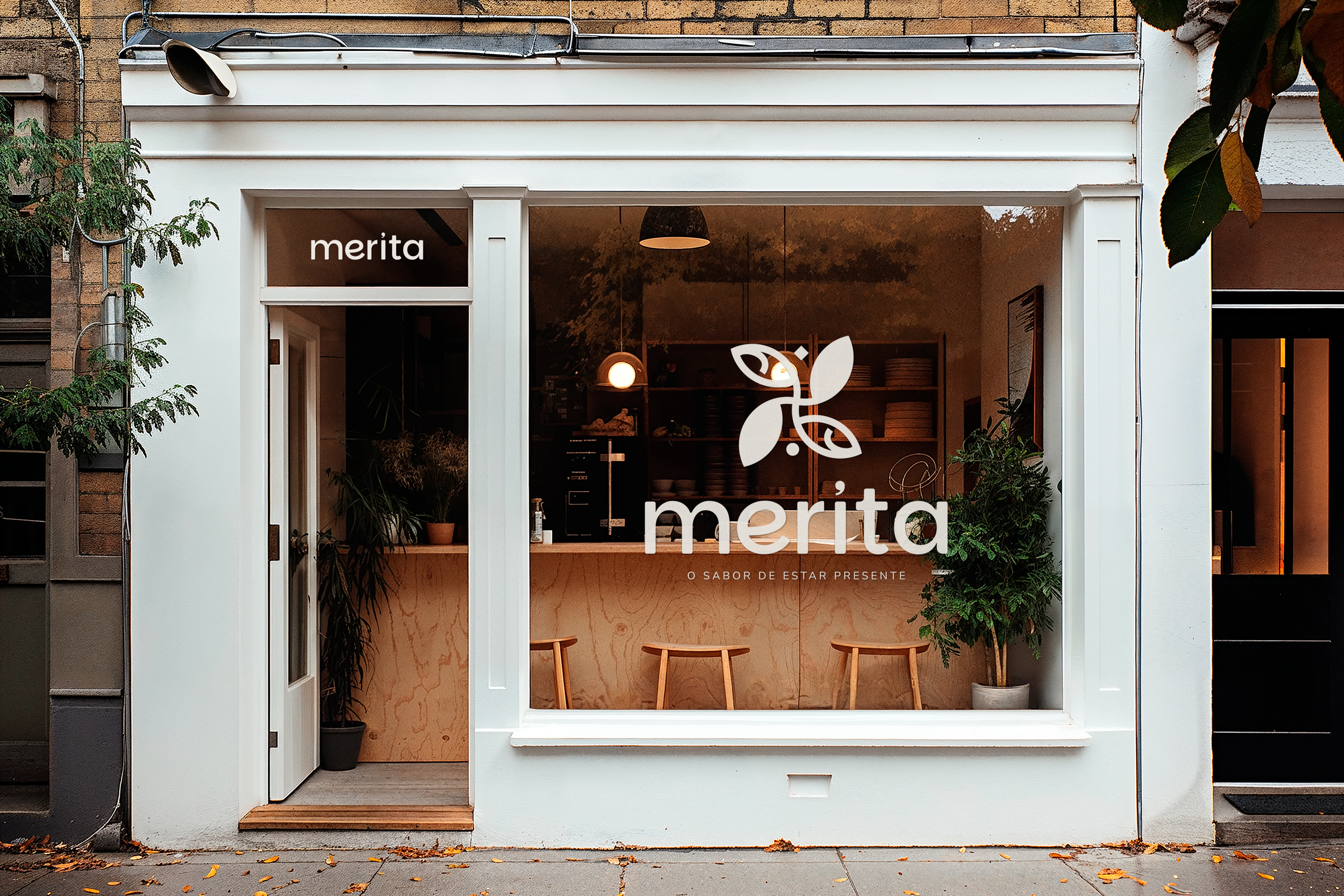
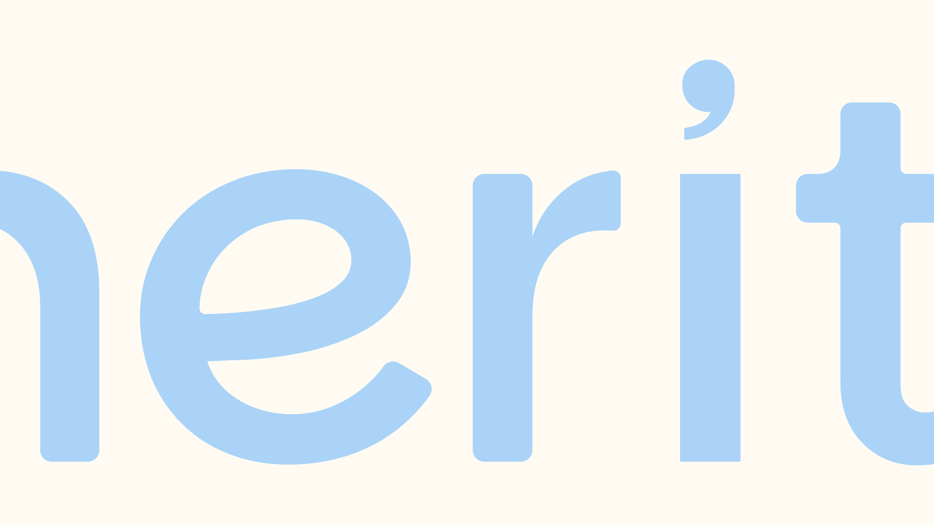
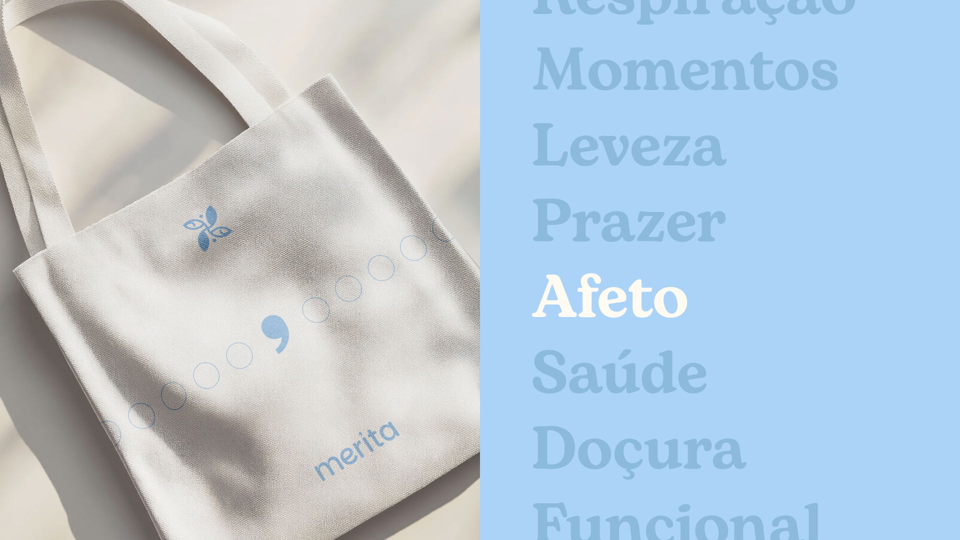
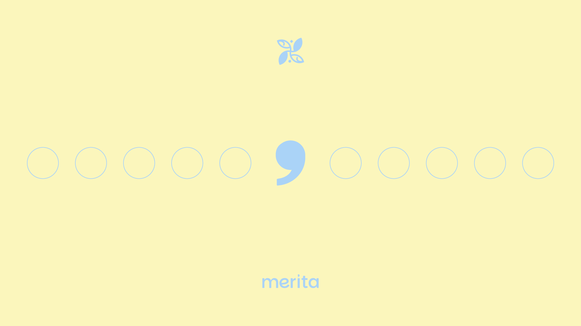
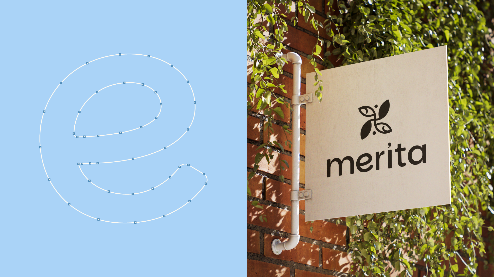
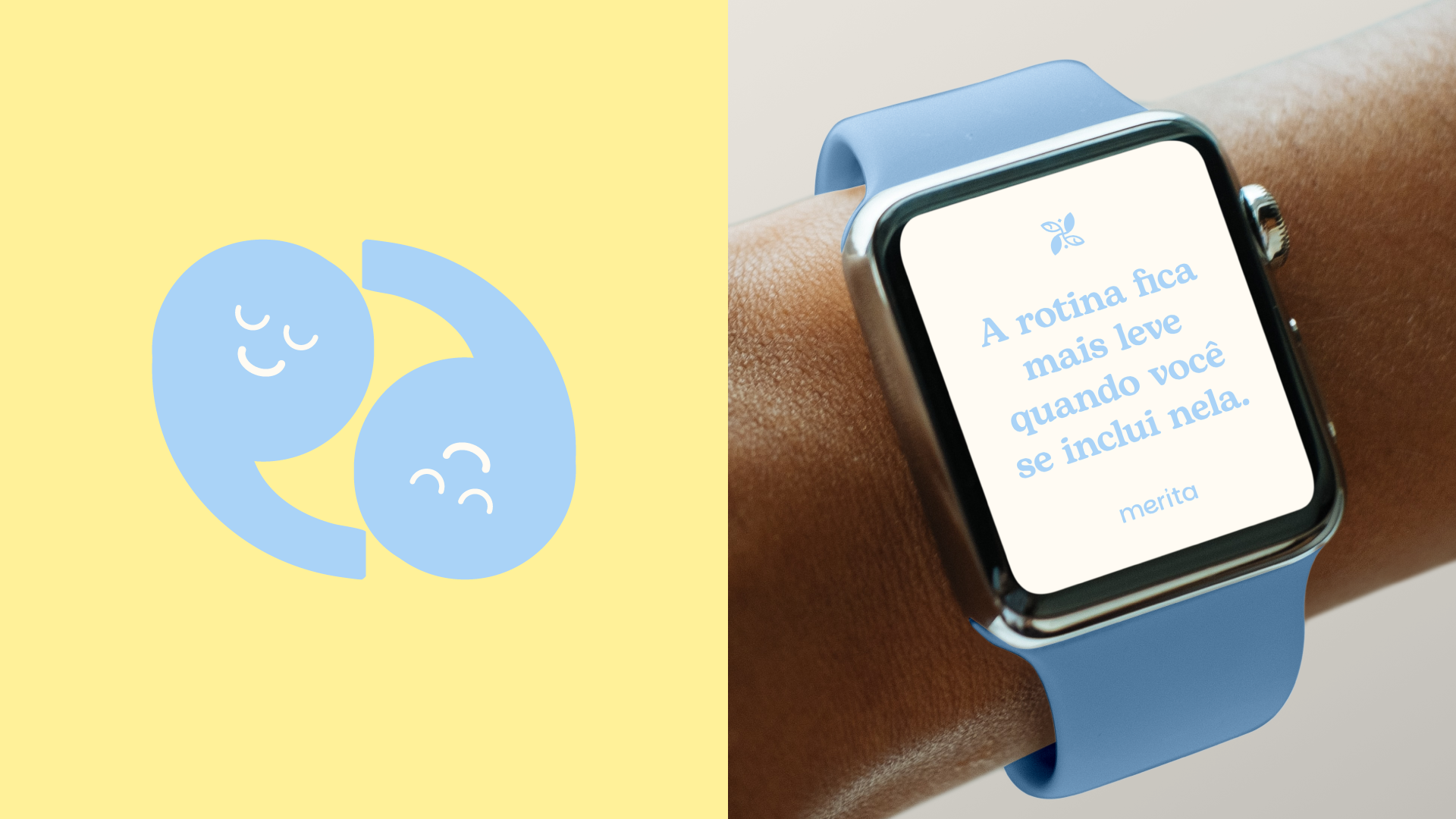
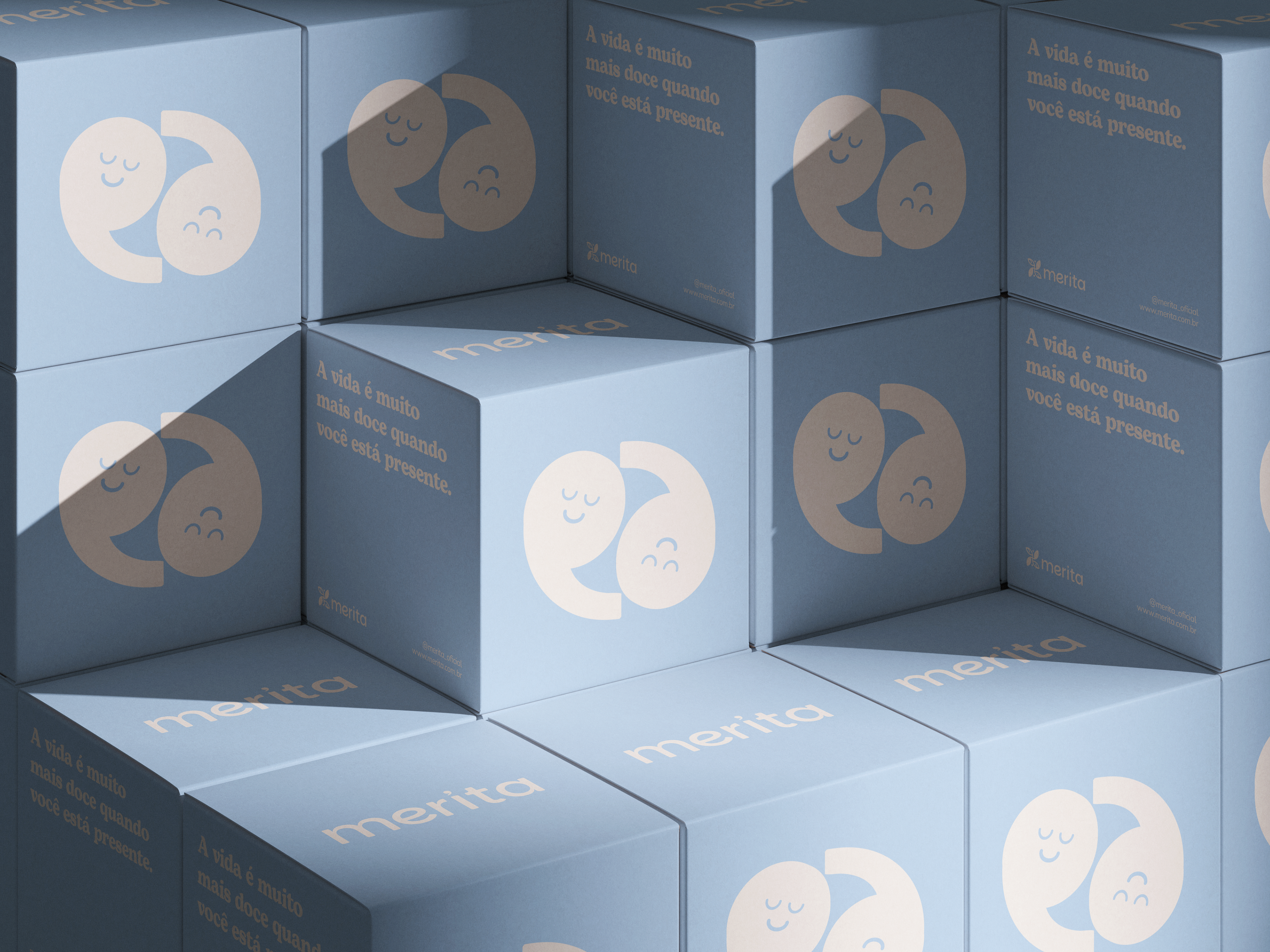
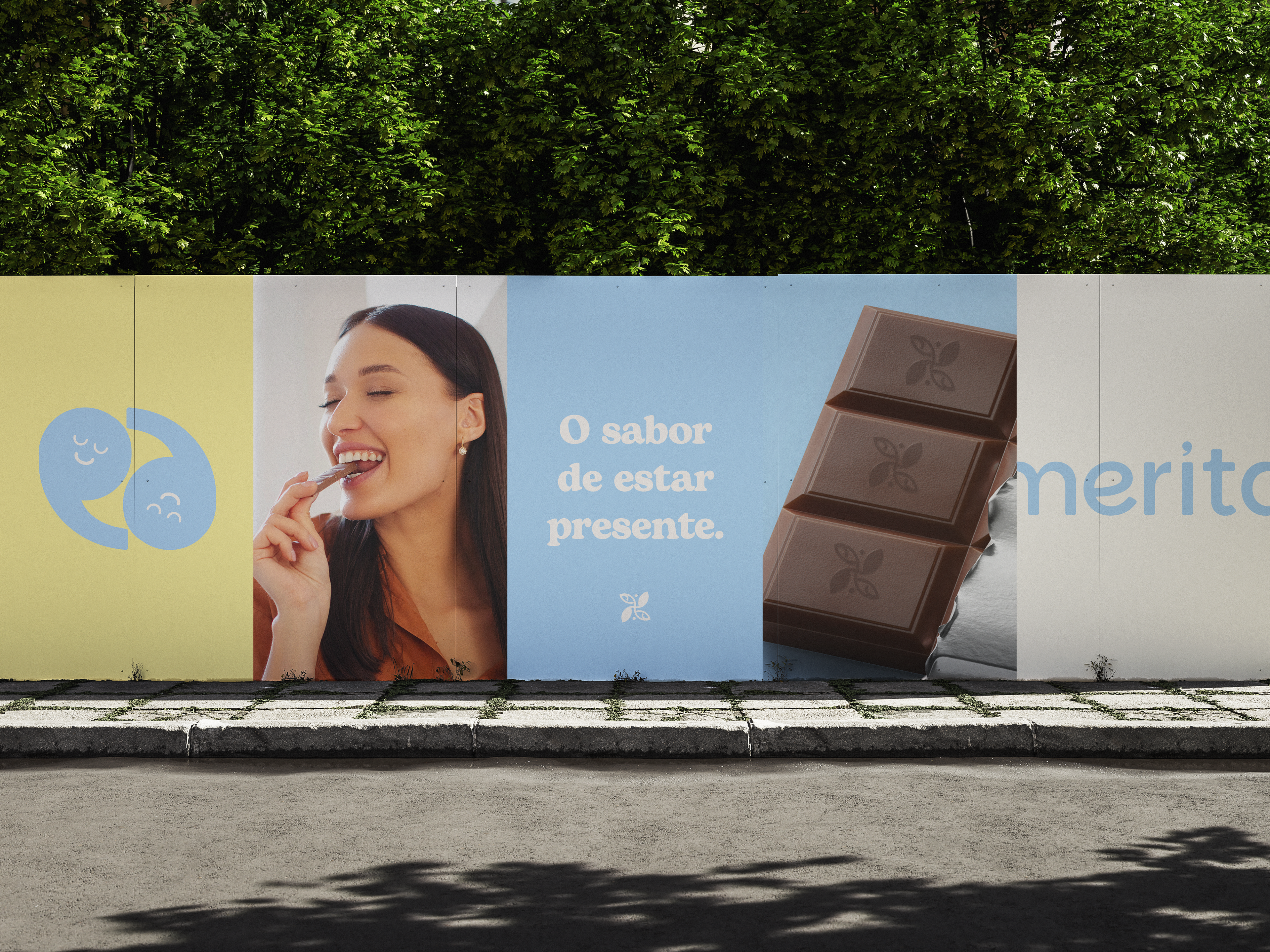
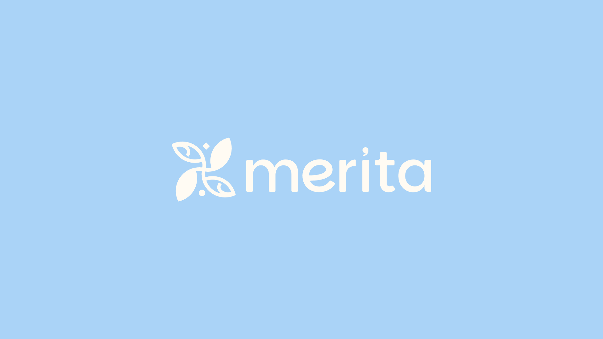
→ A materialização da Merita ocorre através de uma identidade que equilibra o rigor geométrico com a fluidez orgânica, refletindo a harmonia essencial entre o corpo e a mente. No coração do logotipo, a vírgula deixa de ser um mero sinal gráfico para se tornar o elemento central da nossa narrativa: ela é a representação física da pausa necessária no fluxo contínuo do cotidiano, o respiro exato entre o que fomos e o que nos tornamos após um momento de cuidado. Essa leveza é reforçada pelo desenho das folhas, que evocam a serenidade da natureza e a paz de um ritual funcional onde o design serve ao bem-estar. Visualmente, a marca percorre um caminho de refinamento, partindo de formas primárias e simples, como o círculo, para estruturas mais polidas e lapidadas. Esse movimento simboliza a própria transformação pessoal que a pausa proporciona, um processo de polimento da rotina para que possamos encontrar a nossa versão mais leve e consciente.
[EN]
→ The materialization of Merita occurs through an identity that balances geometric rigor with organic fluidity, reflecting the essential harmony between body and mind. At the heart of the logo, the comma ceases to be a mere punctuation mark to become the central element of our narrative: it is the physical representation of the necessary pause in the continuous flow of daily life, the exact breath between who we were and who we become after a moment of self-care. This lightness is reinforced by the design of the leaves, which evoke the serenity of nature and the peace of a functional ritual where design serves well-being. Visually, the brand follows a path of refinement, starting from primary and simple shapes, such as the circle, toward more polished and refined structures. This movement symbolizes the very personal transformation that the pause provides, a process of polishing one's routine so that we can find our lightest and most conscious version.